Thursday, August 19, 2010
Gmail for iPad Gets Minor Makeover
Posted by Michael Knutson in "Apple iPhone, iPod Touch, iPad" @ 09:30 PM
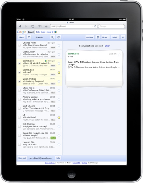
"Google has modified the iPad front-end for Gmail, adding a new "stacked card" interface for the e-mail service. Previously, two toolbars were on screen to run actions on conversations. One controlled selected conversations, however, while the other handled an open ones, which Google acknowledges was potentially confusing."
Google has updated the US English Gmail UI for the iPad to be much less confusing by removing the second on-screen toolbar present in the previous version. The new interface uses a 'card metaphor' and stacks conversations, making it feel much more like a native iPad app.


