Tuesday, May 4, 2010
My Month With The iPad
Posted by Jeff Campbell in "Apple iPhone, iPod Touch, iPad" @ 06:00 AM
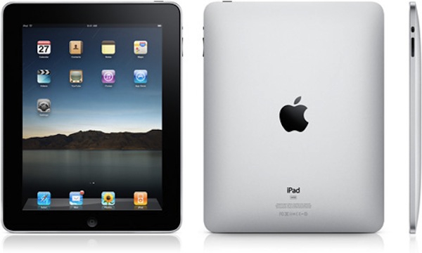
Product Category: Tablet Computer
Manufacturer: Apple
Where to Buy: Apple, Amazon.com, Best Buy
Price: Wi-Fi Version 16GB $499.00 USD, 32GB $599.00 USD, 64GB $699.00 USD; 3G Version 16GB $629.00 USD, 32GB $729.00 USD, 64GB 829.00 USD
Specifications: Apple Technical Specifications
Pros:
- Truly portable computing for browsing and media;
- Compatible with major eBook apps as well as ePub standard;
- Magazines in all their full color glory;
- Yes you can use it for work, however there are limits;
- Nice start to the accessories list.
Cons:
- No Flash but that may not be a con later;
- Not all sites are optimized for video;
- Backlighting may not be optimum for book reading for some;
- No print option without third-party solutions.
Summary: With the introduction of the 3G version this last Friday, those that have waited to purchase one may have joined the iPad owners club over the weekend. So in light of that even, and the fact it's been one month since I purchased the Wi-Fi version, I thought it was appropriate to give you a run down of what I think about the iPad. The nuts and bolts, or technical side of the iPad has been covered extensively (if you are interested, click on the link above under "specifications" and you will learn all you need to know about the inner workings of the iPad), so this review is more from a user point of view. Its is about my experiences in using the iPad over the last few weeks and what I think of it. I'm also assuming in this that you are familiar with the intuitive way of the iPhone and how it operates, as the iPad is very similar in function. So, lets get to the iPad!
Portability and Ease of Use
When I watched the keynote about the iPad, the first thing I thought about from a personal perspective was how easy this was going to be to use and how well it fit my needs. Or rather, how well I fit into the niche that Apple just created with the iPad is probably more appropriate here. In the pre-iPad days of the Campbell household, if I got the urge to suddenly look something up at home it meant grabbing a laptop, or worst case scenario going into the office area and plopping down in front of the iMac. Once I had an iPad, just like Steve Jobs up on stage, I could reach for the iPad on the table and search away from the comfort of the couch. I also couldn't help thinking "it's a giant iPhone," as I'm sure everyone else first thought when they first saw it.

Figure 1: Picture me in Steve's place, enjoying my iPad from the comfort of my living room, although my TV isn't quite as big as his.
When I picked up my iPad on April 3rd, I quickly realized that it was the perfect device for my needs. Portable, easy to handle and most important of all easy to use. The aluminum back combined with the glass front give it a very solid and well built feel to it. Right away I noticed fingerprints on the screen when the display is dark, but when the screen lights up, they really aren't noticeable. With the screen and it's oleophobic coating, it wipes clean very easily. And one thing on the technical side that does have an impact on usage is the battery life. I've found so far, that the iPad battery life is very very good. I'm getting days of periodic usage out of it before I have to charge it, and when I say periodic usage I mean browsing, sending email, watching some video and those sorts of things. I haven't tested it in constant usage but I did do some heavy usage over a period of a couple days and my rough estimates are that I've been getting between 8 and 9 hours of use out of the battery.
It came with all the apps that you need to start such as Safari, Mail, Calendar, Contacts, Notes, Photos, iPod, and others, however it didn't come with iBook pre-installed. Apparently it wasn't quite ready to be included in the Wi-Fi versions when they shipped, but when I started up my iPad i was given the prompt to download it from the App store. A minor inconvenience easily remedied.
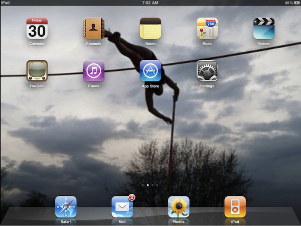
Figure 2: The opening screen on my iPad, with all the initial apps provided by Apple, however the background is one I added of my daughter.
As I said above, using the iPad is just like using your iPhone. Even if you aren't familiar, the learning curve is pretty short with one of these devices. After a few minutes of usage you'll feel like an expert. There are some cosmetic differences in the apps from the iPhone to the iPad, such as in the Calendar app with its nice two page display when in landscape viewing, to take advantage of the larger screen. Aside from that, opening apps, adding apps, moving apps, changing screens, etc all works the same way. Simple. For example, to start Safari and browse all you have to do is touch the icon and you are on the Internet super highway (assuming of course you are already set up with an Internet connection, Wi-Fi only with my version).
Surfing the 'Net
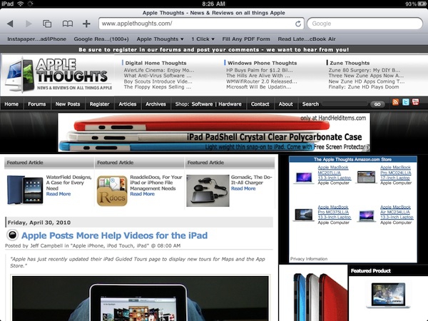
Figure 3: Browsing on the iPad, just by coincidence it's open to my favorite site for all things Apple.
Surfing the 'Net is a breeze on this. The screen is fantastic, and is very responsive to the touch controls. I'd even go as far as saying they are more responsive than on the iPhone. I'm sure the A4 processor has something to do with it, but this is so much quicker than even my 3GS iPhone. The keyboard works very well, even though I initially had some reservations based on the initial exposure via the keynote. I actually thought that I would most likely purchase at least one item in addition to the iPad, namely the keyboard accessory. Pleasant surprise for me in that it actually works quite well once you get used to it. And by getting used to it I don't mean after weeks of use. It's more like a few minutes. So let's talk about the Elephant in the room. No, I don't miss Flash. Well, not much anyway. I will admit it would be handy to see some things that I can't see now on the iPad, but if I really want to see it I just use Instapaper and save it for reading later on my laptop. While this may be an inconvenience now, I really think that it will become less of a detriment down the road as sites switch to better options. I think we see where this is going in that it is happening already on sites such as YouTube and Facebook.
Let's Check Email
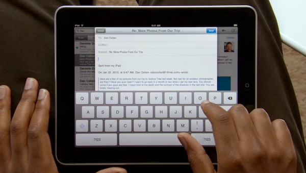
Figure 4: Email screenshot from the Apple help video, using email in landscape mode.
The other obvious thing to do is email, and I really like what they have done with email on the iPad. Basically the set up is just like the iPhone, however the interface is again a bit different to take advantage of the larger screen. In landscape mode it splits into two screens. To the left you get a narrow partition, with a list of your emails. On the right side, in a larger partition, is the email you are currently viewing. Simply touch on any email on the left to bring it into view on the right side of the screen. From here you can reply, delete, forward, etc by using the icons to the top right of the screen. If you are holding it so that it is in portrait mode, you get a view of the email you are viewing in full. Simply by touching the inbox button at the top left of the screen it brings up a list of your emails in a drop down window so you can quickly switch to the one you want. As you can see from the image above, the keyboard does take up quite a bit of space in landscape mode, but it also puts the email into a smaller window above the keys so you get a closer view. In portrait mode it isn't so obtrusive as it sits in the bottom of the screen, almost like it is part of the email.
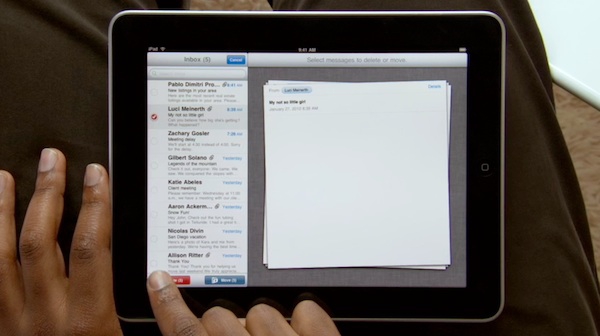
Figure 5: Editing mail on the iPad.
One thing I really like about how mail works is it's use of the edit feature. Hit the edit button in the upper left of the screen and it allows you to move or delete your emails. Simple touch the circle next to the email and it stacks them into the screen on the right. Once you have selected the emails you either delete or move them. This is just an example of how Apple has really paid attention to details as far as the interface. Functionally, they could have done it a lot simpler, but this method really adds to the effect. They stack the selected emails in the right side of the screen, much like you would do if you were putting papers on top of each other. Adding to this bit of coolness, if you unselect an email, the corner of the top email curves back as the un-selected email slides over to your inbox. You can see as well as other features in action over at Apple, where they have posted several guided tours, including one about mail.
Watching Video
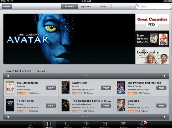
Figure 6: iTunes on the iPad.
This is only a month into the iPad so I won't try to convince you that it's the greatest thing ever for video, and you can watch whatever you want on it, but what you can watch displays beautifully. That said, there is the obvious Flash limitation. While you can watch video from CBS on their iPad site, you are limited to Survivor. And on Fox? Forget about watching Fringe episodes. Or any for that matter since they won't play. And don't even bother with NBC, they don't even have an iPad enhanced site and it looks terrible. CBS and Fox are in with Hulu so that will be an option once Hulu has their app out (or is it if they get one out), but I'm sure it won't be free like it is on ABC. I'm not going to get into a long drawn out debate on Flash for this review. Let's just say that the web is changing, and more sites are opting to switch to using H.264 for their videos so I don't think Flash is going to be much of an issue in the coming year. If you are interested in Apple's viewpoint (or is it Steve Job's, I guess they are one and the same aren't they?) on this issue, you can read his latest missive on it here.
There are still many options, as indicated by the growing list of sites at Apple that are deemed "iPad-ready websites." Granted, not all the sites that are "iPad friendly" are on this list, just the ones that Apple has deemed worthy after they submitted their site to Apple. In addition, there are several apps to use, such as the free ABC Player app that was available on launch day (I just hope that Hulu with their rumored iPad app follows suit soon). The ABC Player is a great app that I have used frequently over the last month to watch several of my favorite ABC shows, such as Lost and V. I have also used the free Netflix app to watch movies, documentaries and TV series. These two apps are examples of how great viewing video on the iPad can be if done correctly. To add to my viewing list, I can also put some of my own DVDs on the iPad via iTunes or just rent something from the iTunes store.
Bottom line is this thing has only been out a month and it is still sorting through issues, so I think it is only a matter of time before you see a greatly improved list of video choices.


