Monday, March 9, 2009
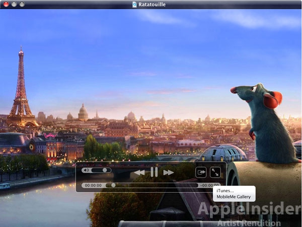
Apple Insider Mocks Up New Quicktime X UI
Posted by Vincent Ferrari in "Apple Software (OS X)" @ 01:00 PM
"QuickTime X Player is said to forgo all traditional interface controls in favor of video overlay controls (like those that appear when you mouse over video in full-screen mode of the current Player software). The only window-based interface element in the QuickTime X Player is reportedly the title bar, which is reminiscent of the iPhone's semi-transparent black glass interface while also adopting hues from the video frames playing beneath it"

One of the big UI improvements for Snow Leopard will be QuickTime X. QuickTime's UI is ancient, at this point, and it's about time to bring it back in line with the rest of the OS. If Apple Insider's mockups are anything like what we're actually going to get, then things should be great. The player should, in a common sense world, get out of the way, so that you can enjoy the content.
Here's to hoping QuickTime finally gets the UI update it seems like every other OS X system app has gotten over the past 5 years.


