Monday, March 2, 2009
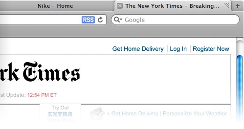
Tabs in Titlebars Ruin People's Experience?
Posted by Vincent Ferrari in "Apple Software (OS X)" @ 01:00 PM
"To me, it seems like Apple had heard that 'Chrome has tabs on top,' but instead of just being honest and admitting that Google got it right, they set a goal for themselves to make as many arbitrary and useless changes as possible so they could still claim they were innovating. All these changes resulted in this botched and confusing tabtitlebar abomination that not only looks horribly out of place on both Mac OS X and Windows, but is also a functional disaster," Holwerda writes. "I hope Apple's Safari engineers recover from this monumental design frak-up quickly, because if this stays the way it is, I won't be using Safari on my Mac anymore."

I have to say I disagree wholeheartedly with the criticisms of the "Tabs on Top" change to Safari's UI. For me, Tabs on Top enables me to have more screen real estate on my 1440 x 900 laptop for browsing. I like that the tabs take up the same amount of space the window title does, and I think that's one of the things the Chrome team got right from day one. To call the Tab display a "UI disaster" is just patently ridiculous. It's one thing to not like something, but completely another to just shred it in such an overdramatic hyperbolic way.
People who didn't like the changes have come up with Terminal commands to hack up Safari 4.0 to look more like 3.0+, but I've never been happier with Safari than I am with it right now with no modifications. Of course, I didn't just see the new UI, freak out, and immediately figure out how to go back to the old one (yep, I actually tried it, used it, then judged it!).


