Friday, November 7, 2008
Review of Google Earth for the iPhone
Posted by Joe Johaneman in "Apple Software (iPhone/iPod Touch)" @ 12:00 PM

Product Category: iPhone App
Developer: Google
Where to Buy: iTunes App Store
Price: Free
System Requirements: iPhone 2G or 3G
Specifications: Google Earth requires 9 megabytes of free space for the application. You should also have some extra space available for caching.
Pros:
- The information overlays are informative and interesting;
- Very responsive over WiFi and 3G;
- Fun and easy to use
Cons:
- Slow under the EDGE network;
- Information Overlay icons are too small for thick fingers
Summary:
Google Earth for the iPhone is a fun and mildly addictive application. Its incredibly intuitive interface makes it a joy to use.
Satellite Mapping
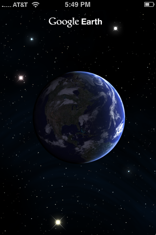
Google Earth has always been a fun and interesting desktop application, and now it's available for the iPhone. The iPhone and Google Earth are a natural match. For those not yet aware of the application, it allows a user to view satellite imagery of the Earth. While that doesn't sound particularly exciting, the manner in which the maps are presented is almost magical. This free app starts with the familiar shape of the globe. Using your fingers, you can rotate the globe, and then you can zoom in by double tapping anywhere on the globe. Finger pinching will zoom in and out of the globe. The app is also accelerometer driven. Tilting the phone changes the angle at which you are viewing the map.
I tested Google Earth on an iPhone 2G and an iPhone 3G over the EDGE network, WiFi and 3G (obviously, 3G couldn't be tested on the iPhone 2G). The application is extremely responsive over WiFi and 3G. As would be expected, I noticed significant lag over the EDGE network, but it was responsive enough to be usable.
Information Overlays

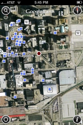
Figure 1: Indianapolis with some of the points of interest highlighted.
The maps have information overlays that can be toggled on or off in the Settings menu. There are currently two overlays: Wikipedia and Panoramio. The Wikipedia overlay (which show up as tiny WikiPedia icons) returns articles about landmarks, and Panoramio (which shows up as small blue squares) returns photos that were geotagged near that area. I found the icons for the information overlays were too small for my thick fingers and so I often had trouble hitting the right icon when several were clustered together.
Besides the information overlay, there are four icons, one in each corner. The top left icon is search, and like Google maps, you can search for stores, restaurants and landmarks near any location. The top right icon is a compass, and tapping it will align the map with north at the top. The bottom left icon determines your current location using either GPS or cell tower triangulation and then automatically rotates and zooms there. The final icon in the bottom right hand corner opens the settings dialog.
Conclusion
Google Earth for the iPhone is a useful, fun and intuitive app. It's a natural fit to the iPhone's touch screen. While the information overlay icons are too small, and the Edge network response is often slow, these were minor in comparison to the features and usability of this free application.
Joe Johaneman is a programmer and web designer in Honesdale, PA and is also an amateur photographer and graphic designer.


