Friday, August 26, 2011
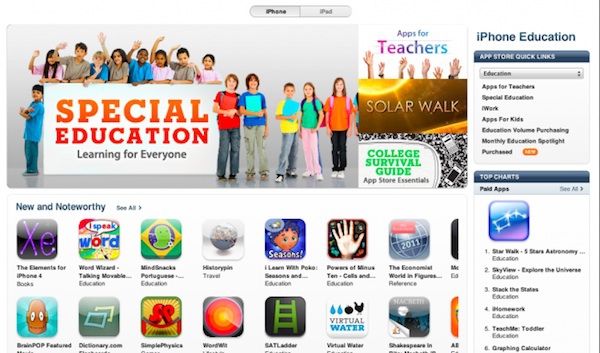
Category Home Pages in the App Store
Posted by Jeff Campbell in "Apple Software (iPhone/iPod Touch/iPad)" @ 01:00 AM
"As pointed out by The Next Web Apple has begun to role out a new redesign for category home pages in the App Store. The redesign follows suit with the home page of the App Store, displaying a large horizontal banner which runs through the category's featured apps. As of now, the redesign is only appearing in the Education and Games sections."

Anything that can be done to make it easier to find worthy apps is a plus for me. With so many applications out there, it was about time they started to refine your search capabilities. I wish they would take it further though, as this change only breaks it down into three subsections: What's Hot, New and Noteworthy and Staff Favorites. What are your thoughts on the change?


