Tuesday, June 14, 2011
Are Aesthetics to Blame for Poor Functionality?
Posted by Jeff Campbell in "Apple iPhone, iPod Touch, iPad" @ 04:00 AM
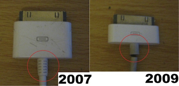
"What you see above is the difference between an Apple powercable circa 2007 and 2009. The one on the left is robust while the one on the right tends to break a whole lot easier. Indeed, an iPod Touch cable I purchased about 9 months ago is already starting to fray after only moderate usage while an old school iPod power cable proved to be extraordinarily resilient."

As the article goes on to say, an insider reports that certain levels of the hierarchy in Apple can influence the design of a product, altering a perfectly good and functional one for one that, to be kind, doesn't work quite so well. Case in point is the design of this power cable. I certainly believe that those that aren't to be "bothered" by the intricacies of functionality might like a cleaner design, but I would also suggest that perhaps it wasn't explained well enough as to why the design on the left needed to stay. Who knows, but the change certainly wasn't for the better if what you get is a faulty product. What are your thoughts?


