Tuesday, October 5, 2010
Apple MACronomics: Embracing the Ecosystem
Posted by Brad Wasson in "Apple Articles & Resources" @ 05:37 AM

In July I began the journey of moving to the Mac world (refer to the column "Taking the Plunge - Switching to the Apple World"). There were a number of reasons for this, including my perception that the total user experience of using a Mac would exceed that of the Windows platform from which I was moving.
Mac travels and the unboxing
My journey began with the ordering of a 15" MacBook Pro with the 2.66GHz Intel Core i7 processor option running OS X Snow Leopard, an upgraded hard drive (the 500 GB 7200-rpm option), the higher-resolution non-glare screen and 8 GB of memory. I ordered Parallels and MobileMe. I also ordered the Magic Mouse and a wireless keyboard. I placed the order online via the Apple Store and 48 hours later the order started to ship from China. Following the order online, I saw the shipment pass through Japan, Alaska, and the US before arriving in Canada, where I'm located on the east coast.
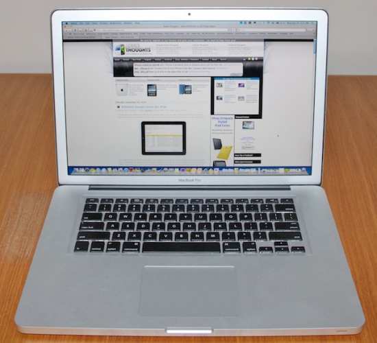
First impressions are important, and the unboxing experience left me with a very positive impression of Apple's quality control. From the moment you open the box until you start configuring your new Mac you can see that attention to detail is prevalent. I had one big surprise during the unboxing: my MacBook Pro has a silver metal bezel surrounding the screen as opposed to a solid black as is shown in the pictures online in the Store. I assume this is because I ordered the upgraded screen with higher resolution and the matte (non-glare) finish. Personally, I prefer this option to the black bezel, but it's not a big deal and either would be just fine.

Figure 1: My new Macbook Pro. Note the silver screen bezel that comes with the non-glare screen.
Two other aspects of my initial impression are worth mentioning. First, the construction of the MacBook Pro is outstanding. It simply looks and feels of high quality, with a fit and finish a notch above other laptops that I have used. The seamless metal casing and the texture of the surfaces exude quality and sophistication. Second, the power cord, a seemingly inconsequential part of your hardware, is a great illustration of the design thought that goes into these Apple products. The connector that you plug into the side of your Mac has a magnetic property which helps you find the right location for it without having to look closely. It's a small thing, but if you transport your MacBook around a fair bit you will quickly find that this is one of those little things that works very well. Are these elements important for your computing experience? Well, they are not critical, but they definitely contribute to the total user experience and heighten the pleasure of using the device.
Getting set up
Setting up the MacBook Pro running OS X Snow Leopard with its initial configuration was straightforward. I was guided through a series of questions regarding my language preference, my location, and so forth, and before long I was seeing the Mac desktop for the first time. I think most people with any amount of computing experience can quickly become functional in almost any windowing environment, and the Mac desktop is no exception. The Dock, which is the application launch bar across the bottom of the screen (by default) holds an appealing representation of the applications you might be interested in using through colorful icons. It is, of course, customizable, and within a short while of using your Mac you'll have it set up in a way that makes sense for you. The Windows 7 taskbar and the Dock are similar in functionality, and at the end of the day both get the job done just fine. After a month of use I do find that I still prefer the design of Windows 7 taskbar, in particular its ability to show you application state previews by hovering your mouse over the icons, and the ability to close windows from those previews. As with many things about the Mac OS X platform, it's the fact that there are subtle differences between it and the Windows platform that it takes you a while to appreciate the overall design. The taskbar/Dock comparison is one example of this, and the more you learn about the features of functionality of the Dock, the more you appreciate it.
Experiencing new things
One of the exciting things about learning and exploring a new platform is the delight you feel as you find new and interesting features. Like the Windows platform, the Mac is full of these features that are not immediately obvious. The Finder is a great example of this. This is the Mac OS X utility for browsing your file store, and in basic use it is similar to the Windows Explorer or any of the plethora of file management utilities you will find developers providing. It is a very deceptive tool though, in a positive sense. It takes a thorough study of it to unearth the hidden marvels of Quick Look, file and folder views, document information, and more. Two features jump out as being significant and "worth the price of admission". First, folder views can be customized on a folder by folder basis, and, here it is, those customized states are "remembered" consistently. Hopefully you know what I am talking about here - in my experience Windows has struggled to make this work correctly in all releases. Seeing it work on the Mac is just wonderful. The second nice feature of the Finder is the Quick Look preview of files that can be initiated by hitting the space bar (or other keystrokes and mouse clicks). Have you ever noticed how on Windows this just does not work consistently, even for Microsoft's own products? In Windows 7 they have a file preview mode option built into every Windows Explorer window, but in my experience it is frustratingly inconsistent. This is an example of a little productivity boost that when executed successfully makes a big difference in the total user experience. There's a lot more to the Finder, of course, and in later columns I'll be mentioning it again.


